What does “balanced” mean for binary classification data? It simply means that the proportion of each class is equal. In binary classification, data is made up of two classes, positive and negative.
What’s imbalanced classification?
Take 1000 samples for example, one class is 500, and the other class is 500 in balanced data. 50% of data are positive class, and vice versa. The distribution becomes skewed once it’s shifted toward one class, and is then called imbalanced data.
Imbalanced data is common in real life, such as fraud detection, cancer detection and customer conversion. However, it is not often mentioned in machine learning theory courses, based on my learning experiences. Here are some useful notes summarized from my personal learnings on real life data, that I feel worth sharing with everyone.
How far of a shifted distribution is considered imbalanced? There is no definite answer. Luckily there are some empirical rules to follow: In Google’s online course, it considers 20 - 40% minority class as mildly imbalanced, 1 - 20% as moderately imbalanced, and <1% as extremely imbalanced. (Usually, minority class indicates positive class.) In the video from h2o about the top 10 pitfalls in machine learning, it suggests to consider remedies for models when the minority class accounts for less than 10% of the data.
Moreover, Google’s online course suggests to first train the model on the true distribution before jumping into any possible remedies. If the model works and generalizes, then you are good to go! If not, then other strategies should be considered to improve the model. I cannot agree more when I first read about the these guidelines. Based on my personal experience, the model will only work sometimes when fitted on true distribution - 20%~40% minority class - without further treatment. It would be great to have a model fitted on true distribution though, as a benchmark for later.
It is important to consider remedies when it doesn’t work on true distribution, since most algorithms in machine learning learn weights from the data. Imbalanced volume of data would affect the learning process of algorithm - learning way more from the majority class. Here are some remedies for imbalanced classification, but it is not our focus today. We’ll cover it in future posts.
- Select alternative metric
- Choose appropriate cutoff
- Cost-sensitive learning
- Downsampling & upsampling
Precision-Recall Curve
In this post, we are going to talk about the Precision-Recall (PR) curve, which is similar to the ROC curve (Receiver Operation Characteristics) but with one of the axis changed from FPR to precision. Notably, the Precision-Recall curve can be used as an alternative metric to evaluate the classifier when the data is imbalanced.
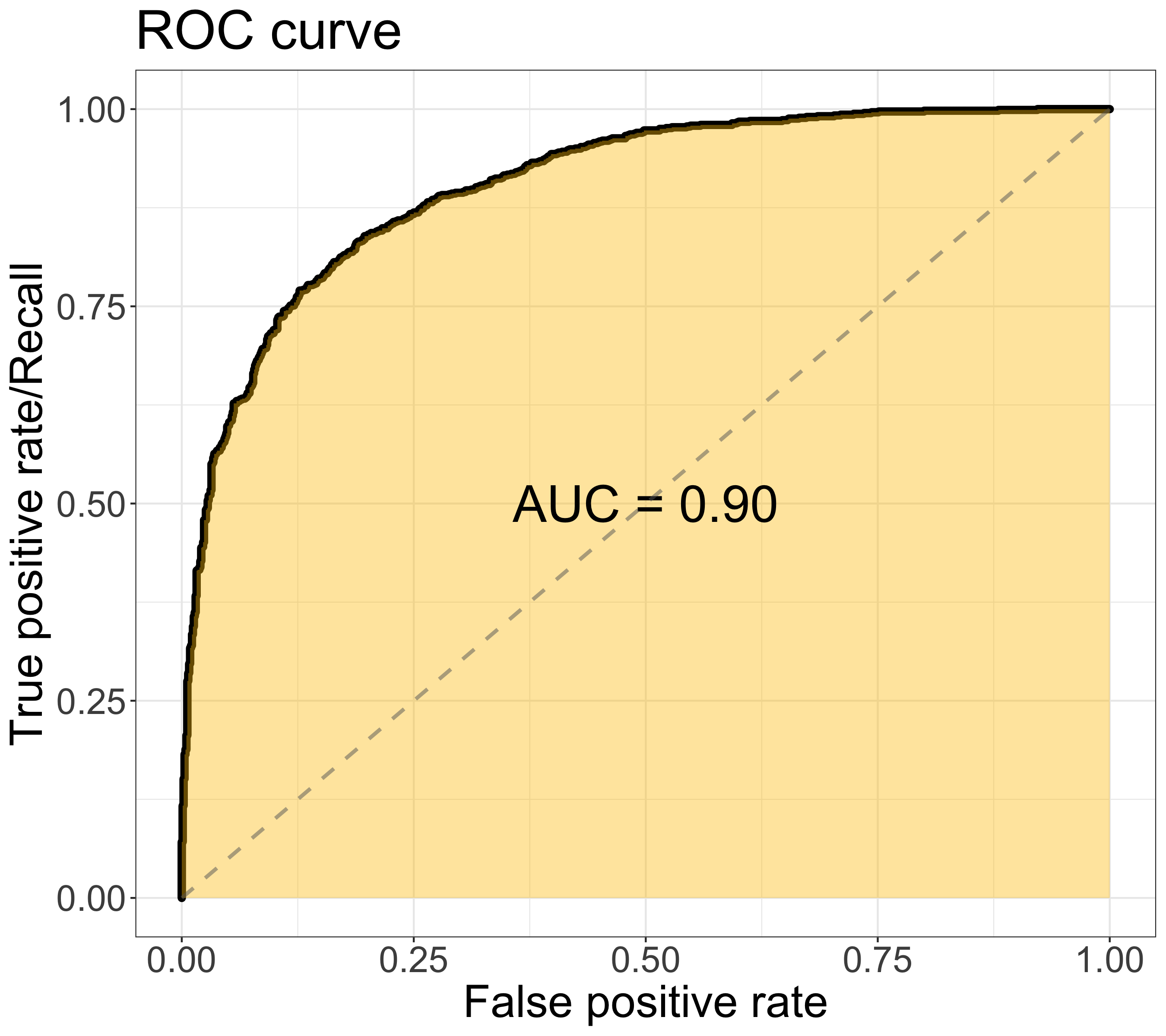
In ROC, the curve is composed of the false positive rate (x-axis) & the true positive rate/recall (y-axis), as shown in figure below. The area under the ROC curve (AUC) is a widely-used metric to assess the overall model performance. The value of AUC ranges from 0 to 1, the larger the better. The ROC curve would move toward the upper left corner when the model performance improves. (Find in-depth discussion in previous post)
On the other hand, the PR curve is composed of the recall/true positive rate (x-axis) & the precision (y-axis), as shown in figure below. The area under the PR ROC curve (PR AUC) provides a different perspective on evaluating the result of binary classifier. Lager PR AUC value indicates better model performance — the PR curve would move towards the upper right corner.
Not all the value between 0 to 1 is achievable for PR AUC. Varying by data, the baseline of PR curve is the horizontal line with y equals the value of the positive rate — P/(P+N) — the smallest value of precision. When the threshold goes to 0 (i.e. the rightmost point in the graph), all samples are classified as positive samples. That is, the number of true positive is equal to the number of positive samples. Thus, the value of the baseline decreases when the data become more imbalanced.
Details: Precision = TP/(TP + FP), when threshold = 0, TP = P, FP = N, Precision = P/(P+N)
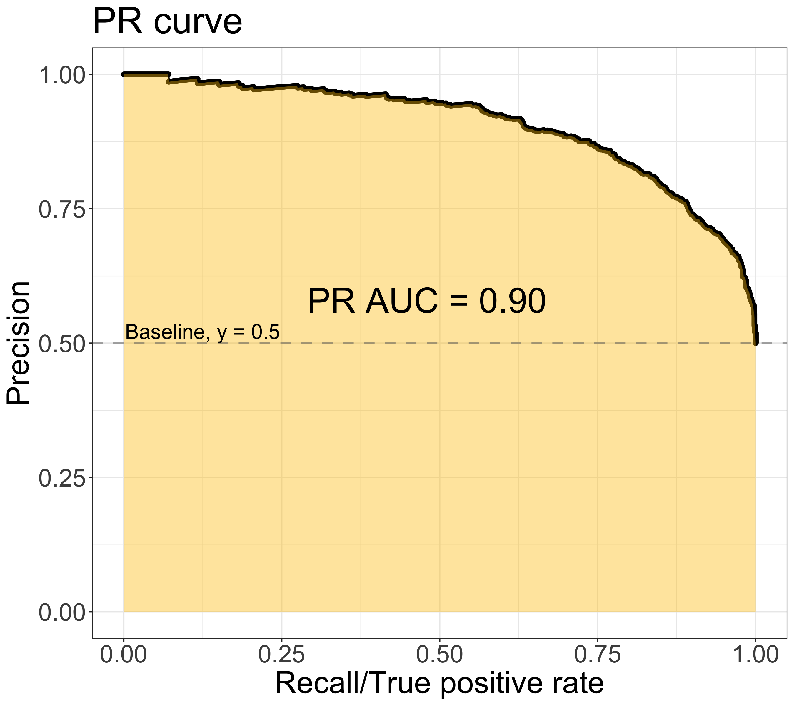
Note: The ROC & PR ROC figures are plotted using the same dataset, which is binary classes with balanced classes
Why we need PR curve?
When data is imbalanced, the AUC might not reflect the true performance of the classifier. The definition of the False Positive Rate (FPR), is the number of false positives divided by the number of negative samples. FPR is considered better when it’s smaller since it indicates fewer false positives. In imbalanced data, the FPR tends to stay at small values due to the large numbers of negatives (i.e. making the denominator large). Thus, FPR becomes less informative for the model performance in this situation.
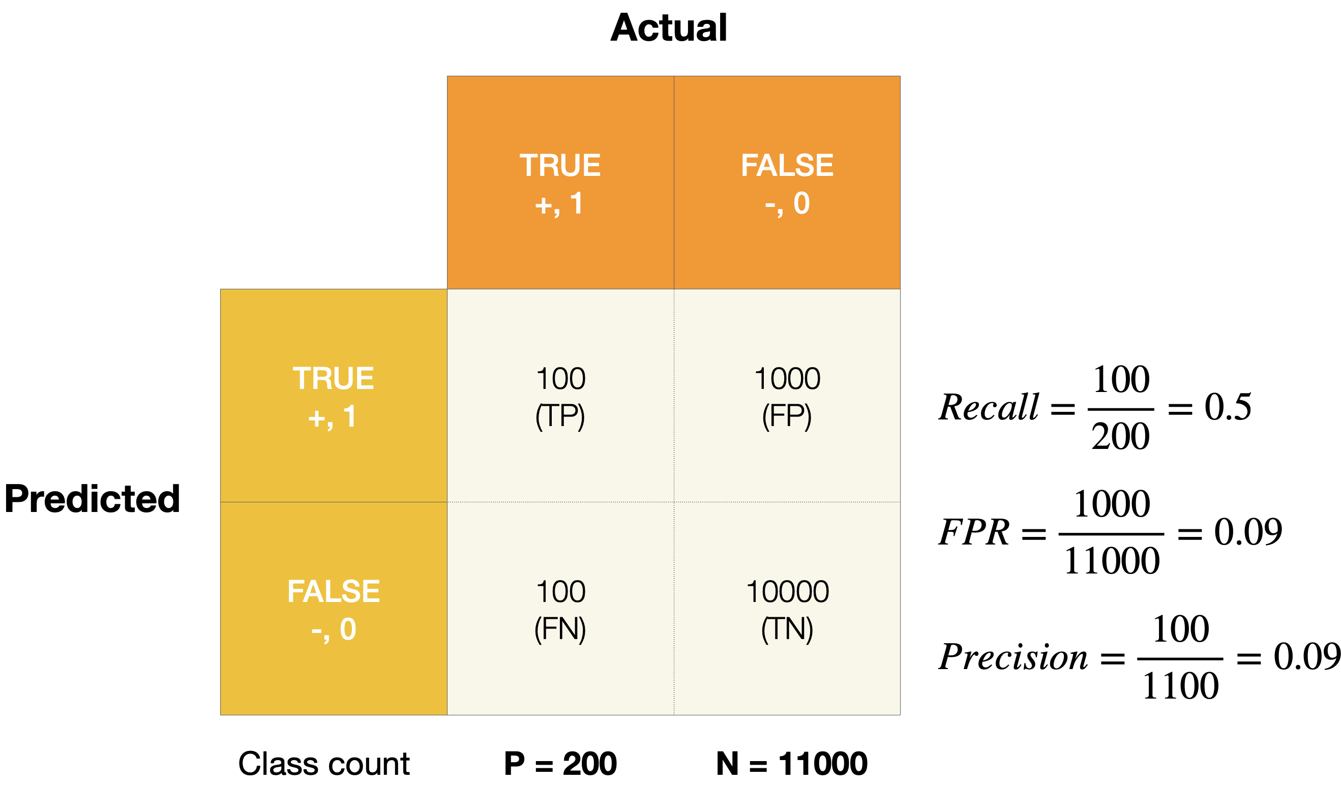
Below is a confusion matrix of an imbalanced dataset. As the figure shown, FPR shows a low value, indicating good model performance. However, precision - 0.09 - illustrates that the model is not able to distinguish between two classes well, and tend to predict more negative samples. Thus, PR AUC provides an alternative view for model performance by switching from FPR to precision.
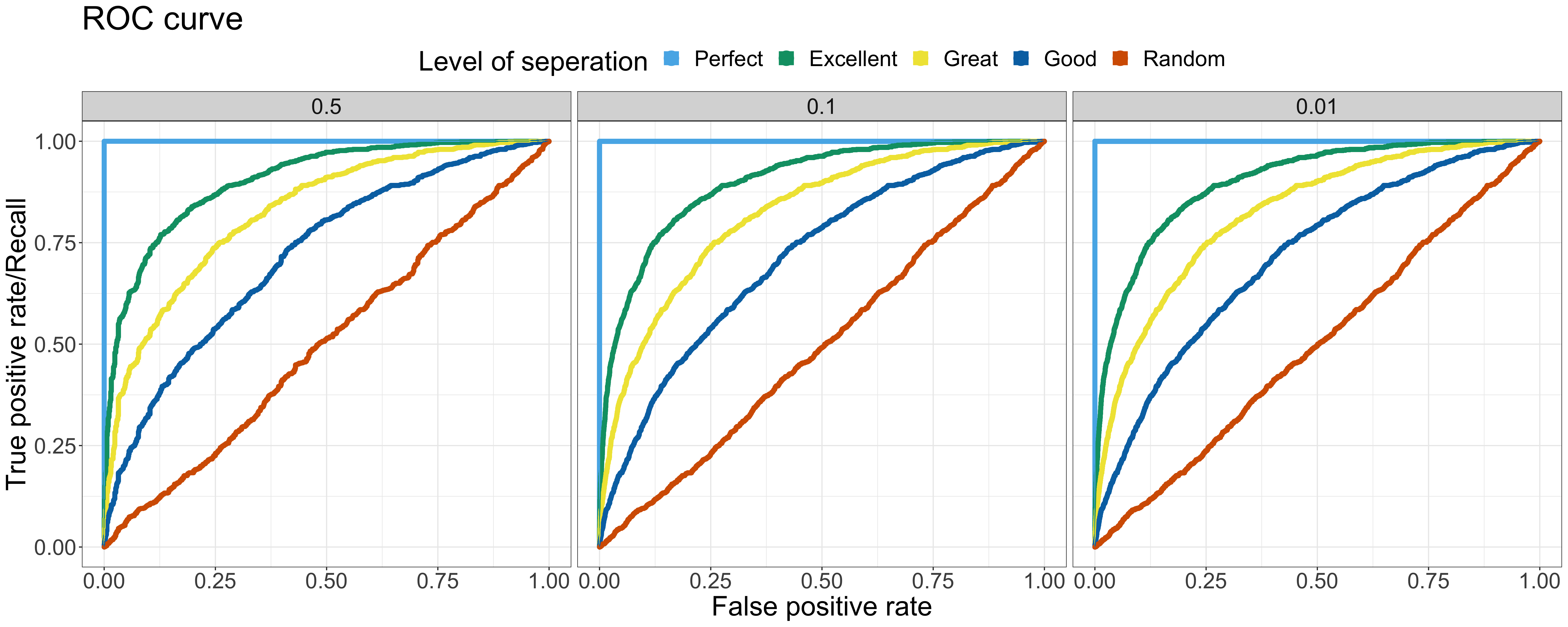
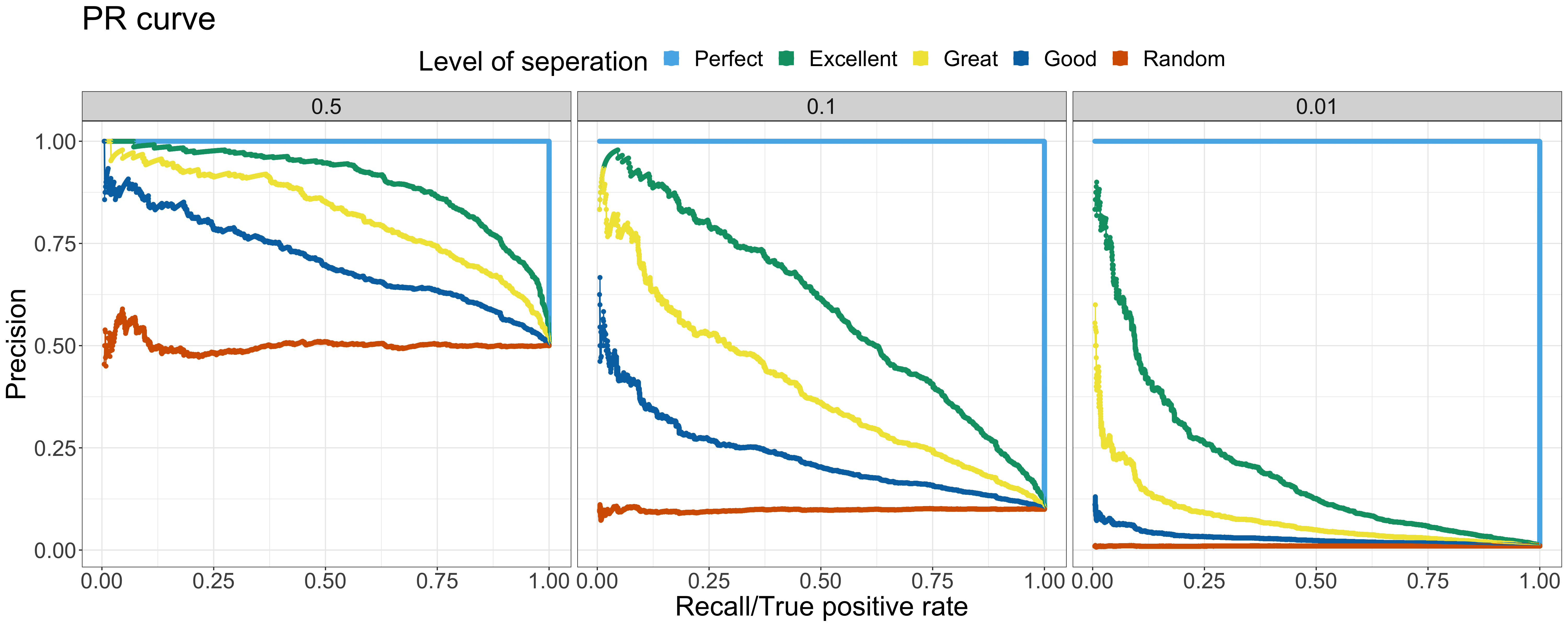
Let’s have a deep dive into more examples. Here are the ROC curve & PR curve of the output of binary classifier at various levels of separation and positive rates. In the following examples, 5 different levels of separation are chosen— Perfect, Excellent, Great, Good, Random — and 3 different positive rates are selected — 0.5, 0.1 and 0.01 ranging from the balanced toward extremely imbalanced. The data with the same level of separation but different positive rates is all sampled from the same distribution but at different sampling rate.
As the figure of ROC curve shown, the model performance across different positive rates are the same — the shape of ROC curve is nearly identical. On the other hand, the PR curves tell a different story — the model performance decreases when the positive rate decreases. When there are more negative samples, it is common to predict more outcome as negative samples, causing the precision to decrease. The baseline of different positive rates is also shown with the level of separation — Random. Notably, when comparing the ROC & PR curves at the same positive rate, the overall relationship among various levels of separation is similar in both the ROC & PR curve. Since the baseline shifted based on the positive rate, it is crucial to compare the PR AUC to baseline first rather than look straight into the absolute value of PR AUC. For example, the PR AUC of the Excellent status with 0.01 positive rate is 0.2. The absolute value of the PR AUC doesn’t look like a good outcome. However, it is 20 times better than the baseline 0.01!
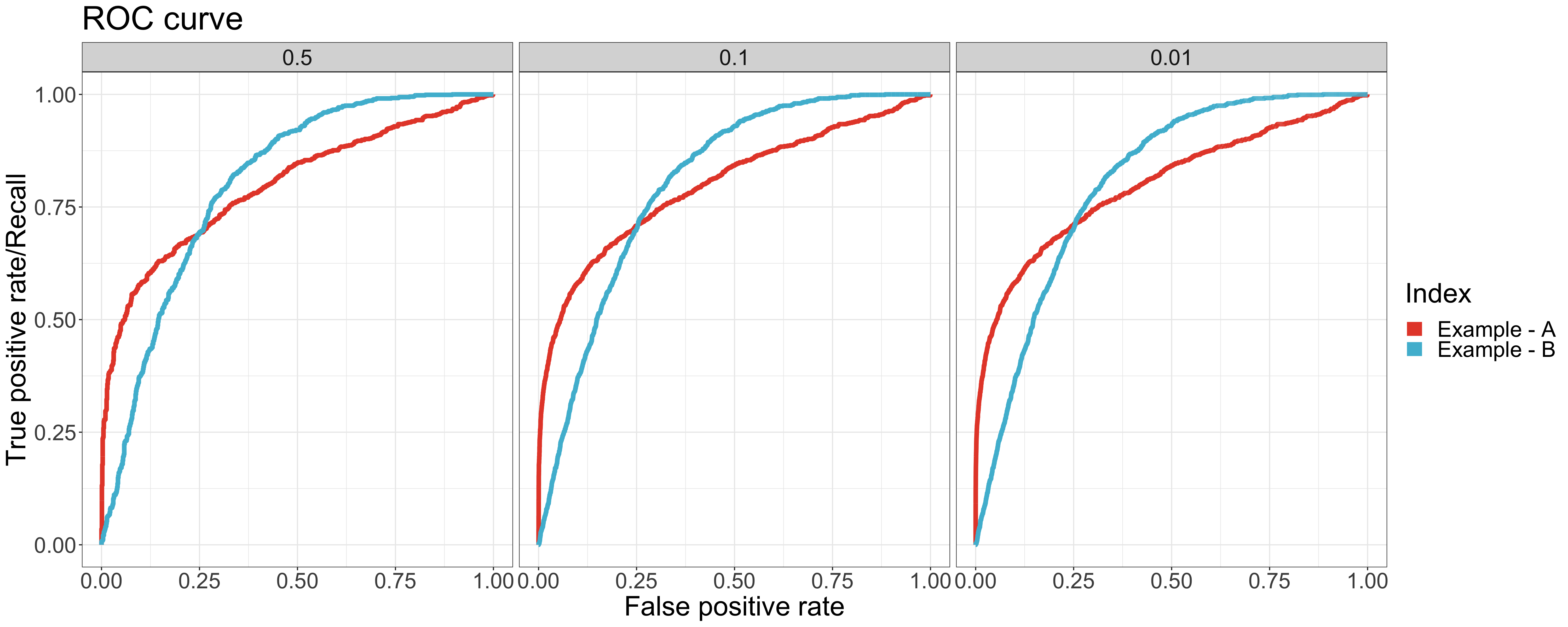
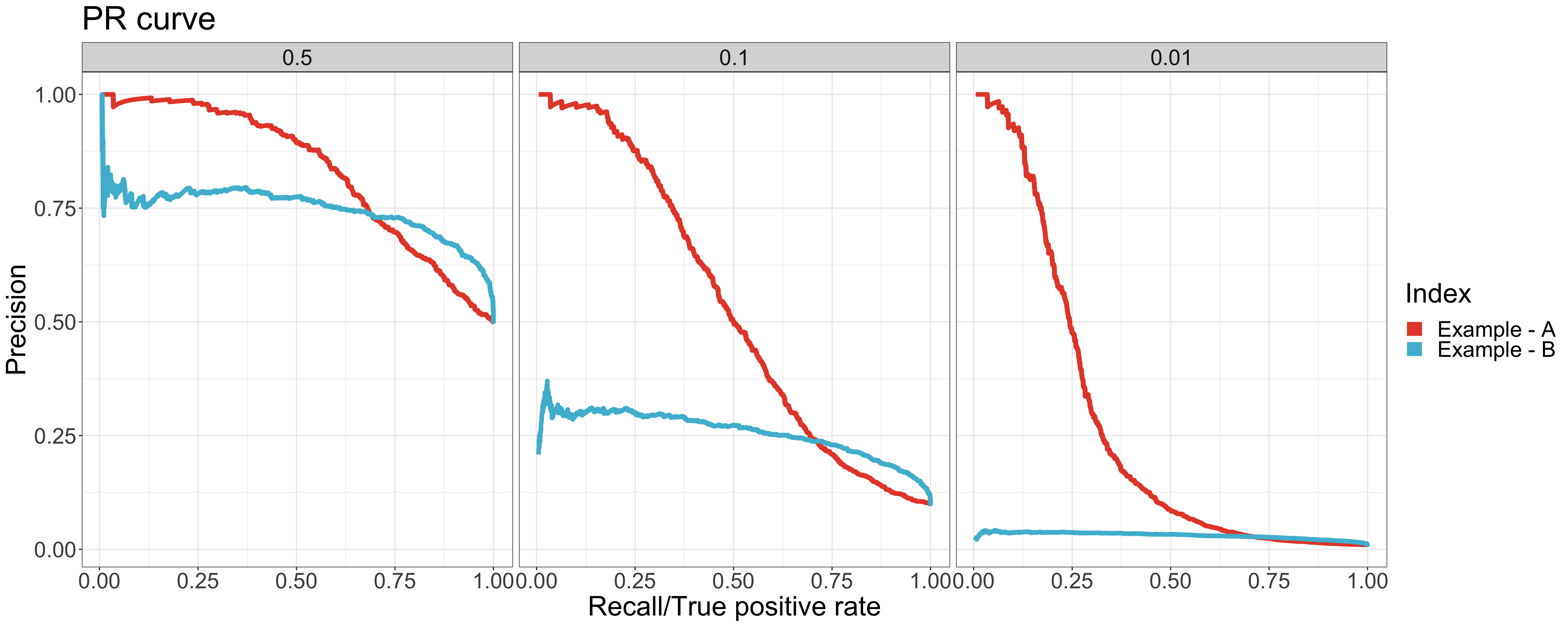
Let’s look into another case. There are two example datasets with the same value of AUC (0.8) but different positive rates. As shown in ROC curve, the curves and values of AUC are all the same regardless of the positive rate. Thus, it is hard to tell which model performs better based only on the value of AUC. With the help of PR AUC, we come to the conclusion that the performance of example A is better than example B, which has a higher PR AUC value for all positive rates.
As shown in the ROC curves, the curves of example A are different from the ones of example B especially around the leftmost area. It indicates that the model of example A performs better in higher-rank samples - where more positive samples are classified correctly. The AUC value doesn’t identify the difference. However, we can clearly see the difference in the value and curve of the PR AUC between example A & B.
| AUC | Positive rate | ||
|---|---|---|---|
| 0.5 | 0.1 |
0.01 | |
| Example - A | 0.8 | 0.8 | 0.8 |
| Example - B | 0.8 | 0.8 | 0.8 |
| PR AUC | Positive rate | ||
|---|---|---|---|
| 0.5 | 0.1 |
0.01 | |
| Example - A | 0.83 | 0.54 | 0.27 |
| Example - B | 0.75 | 0.26 | 0.03 |
To conclude, PR AUC provides the ability to differentiate the performance between balanced & imbalanced data. It also helps to identify the performance around higher-rank area.
When to use PR AUC?
When two classes are equally important
AUC would be the metric to use if the goal of the model is to perform equally well on both classes. Image classification between cats & dogs is a good example because the performance on cats is equally important on dogs.
When minority class is more important
PR AUC would be the metric to use if the focus of the model is to identify correctly as many positive samples as possible. Take spam detectors for example, the goal is to find all the possible spams. Regular emails are not of interest at all — they overshadow the number of positives.
There are no defined rules to select the suitable metrics. It really depends on the data and the application. It is important to think thoroughly about the purpose of the model before jumping into the modeling process.
One thing to note here is that the PR AUC serves as an alternative metric. If the model doesn’t work after the metric is changed, there are still other remedies to deal with imbalanced data, such as downsampling/upsampling. We’ll cover it later in future posts.
Reference
- Google data preparation and FE: imbalanced data
- Classifier evaluation with imbalanced datasets
- What is a good AUC for a precision-recall curve?
- Machine Learning in Action
- Top 10 Data Science Practitioner Pitfalls H2O World 2015
- The Precision-Recall Plot Is More Informative than the ROC Plot When Evaluating Binary Classifiers on Imbalanced Datasets
- Precision-Recall AUC vs ROC AUC for class imbalance problems
- Precision-recall curve
All the plots in this post are made on my own with ideas inspired by above references. Please reference my post when used.